
Monday, April 16, 2012

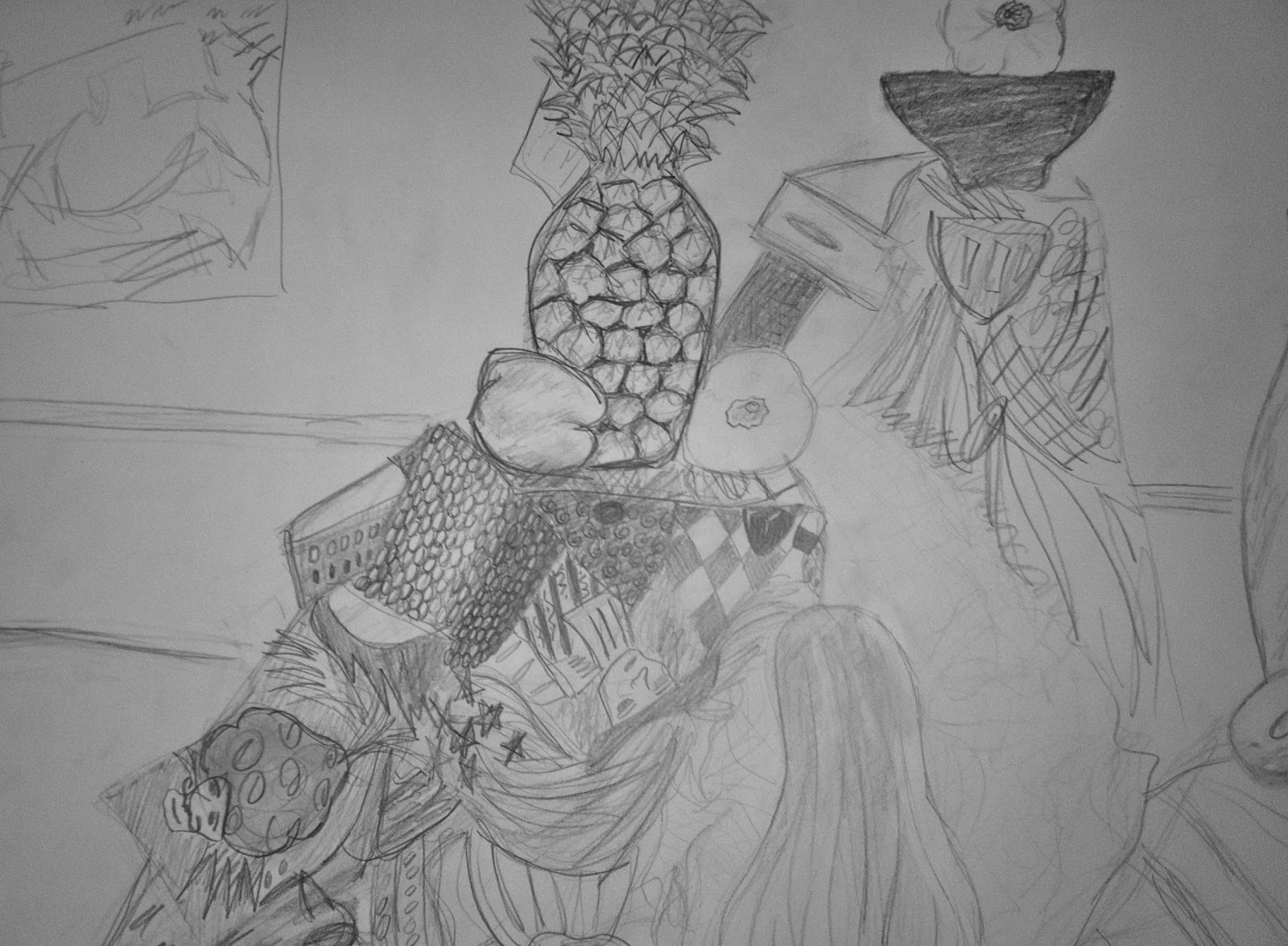
Still Life
Drawing Analysis
1) Gestural Drawings of the Masters, and the meaning of Contours:

Daumier uses numerous lines with a lot of movement in them. This helps to create the motion of a gesture in his drawing, surrounding and part of the contours. The lines behind, next to, and around show movement, especially in the corner. The sqiggly shape of the countour around the man standing on the chair show the force of his voice moving through his body. The shape and placement of the lines also adds to the mood of the figures.
2) Extracting the Essential Gesture and Contour

Here, Matisse uses one streak of solid lines over very light lines to emphasize and show the actual shape. This helps to define the figure, and makes the figure whole. The other lines add to the third dimension of the figure. The important gesture and character are defined with this type of contouring.
3) Drawings with Drapery

Here, Cezanne clearly uses drapery to add to his still life. The cloth is very realistic with many shadows and highlights, giving life and contrast to the oranges and other pieces on and around the table. His drapery seems to be the proper proportions. It also seems to have a realistic placement on the table and around and under the fruit.
4) The Figure in Motion

Degas uses fine lines and chalk, as well as unique shadowing to bring these figures to life. Shadowing around the moving digits. This shows the vibration from motion. Another element which helps show motion is the shadowing on the muscles to show that they are extended or flexed. This can be seen in the neck, back, arms, and legs.
5) Proportions and Blocking: Polykleitos’s Canon

Seen above, Polykleito was drawn first with blocks in the anatomical position to get a proper proportion for the entire figure. Below that map, the figure was moved one block at a time to create the exact angles, placement, and proportion. This seemed to have worked in the drawing or image of the sculpture. This is a clever idea, as I have not seen it before. This is the most specific blocking I have seen.
6) Cezanne, and Diebenkorn: Modern Compositions and interpreting Landscape Space

Diebenkorn uses shadowing of darker colors here to add reality and depth to his painting. He uses highlights to show the sunlight here as well. Without these shadows, the painting would appear flat. Not only do shadows and highlights bring this painting to life, but so do the smoothness of lines and the angles of lines. The roads narrow and the rocks get smaller, showing an illusion of an increase in distance from the bottom to the top of the painting.
Wednesday, April 11, 2012
Space: From Landscape to Trompe L'oil
The Hermaitage at Pontoise by Camille Pissarro from 1867 France is shown below. It uses its foreground, middle ground, and background to create depth. It isn't very deep but it is definitely not flat. You can see this in the houses, the shadowing of the trees, and the pathway, as well as the shape of the road. Also, there are many planes covered in this painting, and the land has hills and a lot of character and substance to them.

The View of Laerdalsoren, on the Sognefjord by Themistokles von Eckenbrecher from 1901 Germany is shown below. This landscape also consists of the foreground, middle ground, and background. It shows a lot of depth with the use of the different mountains along the z-plane. The color of water, clouds, placement of rocks, and people, and the boathouses in the distance also greatly add depth to the landscape.

Below is The Old Violin by William Harnett from 1886.It is nor in the National Gallery of Art in Washington. This piece uses shadowing and depth to show placement and layering of this Trompe l'oeil. The shadow on the paper makes the violin seen closer than the objects it is placed on.


Monday, March 26, 2012
Lettuce


This was one of my favorite assignments. At first, I was frustrated an nervous, as I tried to capture an entire lettuce head. It would have come out too scribbly. I decided to take the backside of one lettuce head (the top photo), and capture it. I was pleased with this one. For the second and third photos above, I decided to capture, and twist or tweak the piece of lettuce show above. I then shadowed a decent amoutn and cut it out, and placed it next to the original piece of lettuce. This was fun!
Monday, March 19, 2012
Model 2


Flowers

Above is my interpretation of flowers in our classroom, which I hadn't really tried to draw before. I am pleased with everything except the area around the bowl, and some of the flowers themselves. Overall, I would say it is an alright drawing for my first time drawing a floral scene.
1/30 - Model 1


Above are some model sketches, which seem to have improved greatly. The proportions are more exact, and the sketches seem to have the warmth of a human being, which makes a huge difference in a sketch. They seem to come to life a lot more than the previous, with the help of shadowing.
Wall Sketch

This is currently the sketch on my bedroom wall - I just repainted the walls pale green around it and am figuring out how I would like to either turn this into a wall piece and keep it there, or recopy it and frame it on my wall. Either way, I plan on adding serious color and detailing it with either paint or pastel, depending.
Tuesday, February 21, 2012
Young Couple Sketch

This portrait/sketch of a young couple that I know came out a little to caricature-esque for me. I do appreciate my proportions, and I was just enjoying myself --- next time I will use a much lighter pencil (all I had handy when drawing this was an 8B).
Led Zeppelin - Father Time (complete!)

A personal piece that I started last semester is finally finished! I used #2 HB, colored pencil, and sharpie to complete this piece. It was just a concept that I wanted to personalize and tweak from the original poster. I was pleased with my results, although I am not sure I love the way I did the red font. Others did enjoy, however.

Friday, December 9, 2011


Wednesday, November 30, 2011
11/18/11 - Iconography

Madonna with Christ and St. John the Baptist by Raphael ca 1500
The figures are linked by touching hands and the blue that Mary is wearing is said to symbolize the church. The red signifies the death of Christ. Mary and Christ are staring into each others' eyes and Mary has contraposto. There are contrasts of dark and light and shadowing and depth to enhance the emotion of the image.

Madame X by John Singer Sargent in 1884
This is a painting of a young socialite, Virginie Amelie Avegno Gautreau, the wife of Pierre Gautreau. She was torn apart for this sexually suggestive pose and her pasty white skin. Her black, beautiful dress suggests wealth and beauty, with a dark side, while her posture represents a seductiveness. Sargent captures her maturely in this painting and how he saw her, which I don't think was in the light that the viewers may see her.

Pope Innocent X by Diego Velazquez in 1650
His serious face represents his strong personality and his seriousness as a religious ruler. He is holding a paper that is signed by himself, which symbolizes some agreement, letter, or law. Red symbolizes seriousness, and the outfit and chair symbolize royalty.

Young Woman with a Water Pitcher by Johannes Vermeer in 1662
This woman appears to be a middle class mistress of the house. She is waiting for someone/going to pour water for a guest. Her posture and environment are both peaceful. There is a map behind her of Europe, which symbolizes that she is aware of the world around her. Blue symbolizes the serenity of the portrait. This piece is simple and seems to reflect the Colonial Era.

Pearl by Johannes Vermeer
Vermeer has repeatedly included pearls in his portraits. In this portrait, the pearl and the girl's face are highlighted and catch the viewer's attention. The turban and the pearl seem to be out of the portrait's time period. Some believe the girl is Vermeer's daughter while others think she is the daughter of Vermeer's principle commissioner. Another idea is that she is servant girl, Griet.
"Rita" - Portrait of a Classmate II

After drawing Palmer the first time, in my second drawing of a classmate, I made sure not to push too hard with my pencil. I has a softer touch and this definitely made an improvement. It is much more lifelike and less like a cartoon. The proportions are much better and I and glad to see that even the shadowing is much better.
Sunday, November 13, 2011
VOCAB
Sfumato: a painting technique that use blending instead of harsh outlines. Mona Lisa by Leonardo Da Vinci in 1503 is a great example of this.

Pentimento: an alteration in a painting, which is evident by traces of previous work which show that the artist changed his mind during the creating of the painting. The Arnolfini Wedding Portrait, by Jan Van Eyck in 1434 below is an example.

Pentimento: an alteration in a painting, which is evident by traces of previous work which show that the artist changed his mind during the creating of the painting. The Arnolfini Wedding Portrait, by Jan Van Eyck in 1434 below is an example.

Chiaroscuro: the contrast of light and dark, which is one way to demonstrate the illusion of depth on a 2-D surface. One example is Rembrandt's Self Portrait at 22, in 1628.

Contour lines: lines that surround and define the edges of a subject which add shape and volume. They are not the same as the subject's outlines. These are evident in Paul Klee's Or the Mocker Mocked in 1930, seen below.

Complementary color scheme: the use of colors that are opposite each other on the color wheel. i.e., blue and orange, red and green, purple and yellow. This scheme produces an energetic feeling and creates a vibrant look. Below is an example by a contemporary artist, Chris Carter:

Analogous color scheme: the use of colors that are adjacent to each other on the color wheel. i.e., green, yellow green, and yellow or red, red violet and violet. These color schemes are often found in nature and are pleasing to the eye and give a bright effect, which is appealing to many changing moods. One hue should usually be the main color when using this color scheme. Below is a print by designer Sean Seal:

Monochromatic color scheme: the use of color that consist of different values, meaning different tints and shades, of one color. These color schemes can be effective and soothing, although they are less vibrant than the others. Below is a painting posted by an art teacher, Briggs:

Iconography: the pictorial representation of a subject or a number of images that are put together collectively to illustrate a subject. It can mean the description of representational works or art. It can also mean the study of the visual representation in the arts. Below is Vision of a Knight by Raphael in 1504.

Inconology: the branch of knowledge that deals with the subject of icons or images. It is also the subject matter of the study of icons collectively or as objects.
Foreshortening: the visual effect or optical illusion that either an object or distance appears shorter than it is because it is angled toward the viewer. It is also the act of angling the object toward the viewer to get this affect. Below is a painting of the Foreshortened Christ by Mantegna in 1500.

Crosshatching: creating shading effects with closely spaced parallel lines, with more such lines placed at an angle across them. Below is an example of a lin engraving that uses crosshathing by Hendrick Goltzius' The Massacre of the Innocent in 1617.

Modernism: an art movement that was characterized by an intentional departure from tradition and the use of innovative forms of expression that differentiate an abundance of styles in the arts and literature during the late 19th century and early 20th century. Hans Hofmann painted The Gate in 1960, seen below.

Post Modernism: art, architecture, or literature that reflects against the principles of early modernism such as new kinds of materials and paint and subject matters, as well as a new sense of abstract art. Post Modern art reintroduced traditional and classical elements of style. Modern ideas and concepts were also carried to their extremes. Below is an image create by John Singer Sargent called Madame X painted in 1884.

Picture plane: the plane or flat level, in perspective, that is occupied by the surface of the picture; Its frontal boundary. below is a drawing to further explain the definition. (author unknown)

Foreground: the area of a picture which is often at the bottom. It appears to be closest to the viewer. It is also to give priority to one aspect of a thing over another.
Middle ground: the part of the artwork that lies between the foreground and the background.
Background: the part of the picture that appears to be farthest away from the viewer, which is usually closest to the horizon. It is the opposite of the foreground.
Subscribe to:
Posts (Atom)